Clean Wikipedia
This project solves common e-commerce usability challenges by delivering a seamless shopping experience focused on higher sales conversions.

Title
Clean Wikipedia
Industry
Web
Date
2019
Challenge
Wikipedia is visited by hundreds of millions of people every month, yet its interface has barely changed in decades. The information is invaluable, but the experience of actually reading it feels like stepping into 2004. The core problem was not the content — it was everything around it: cluttered navigation, no clear visual hierarchy, zero mobile consideration, and an interface that made even simple tasks like finding an article or creating an account feel unnecessarily complex. The challenge was to respect Wikipedia's identity and mission while bringing its UI into a standard that modern users actually expect.
Approach
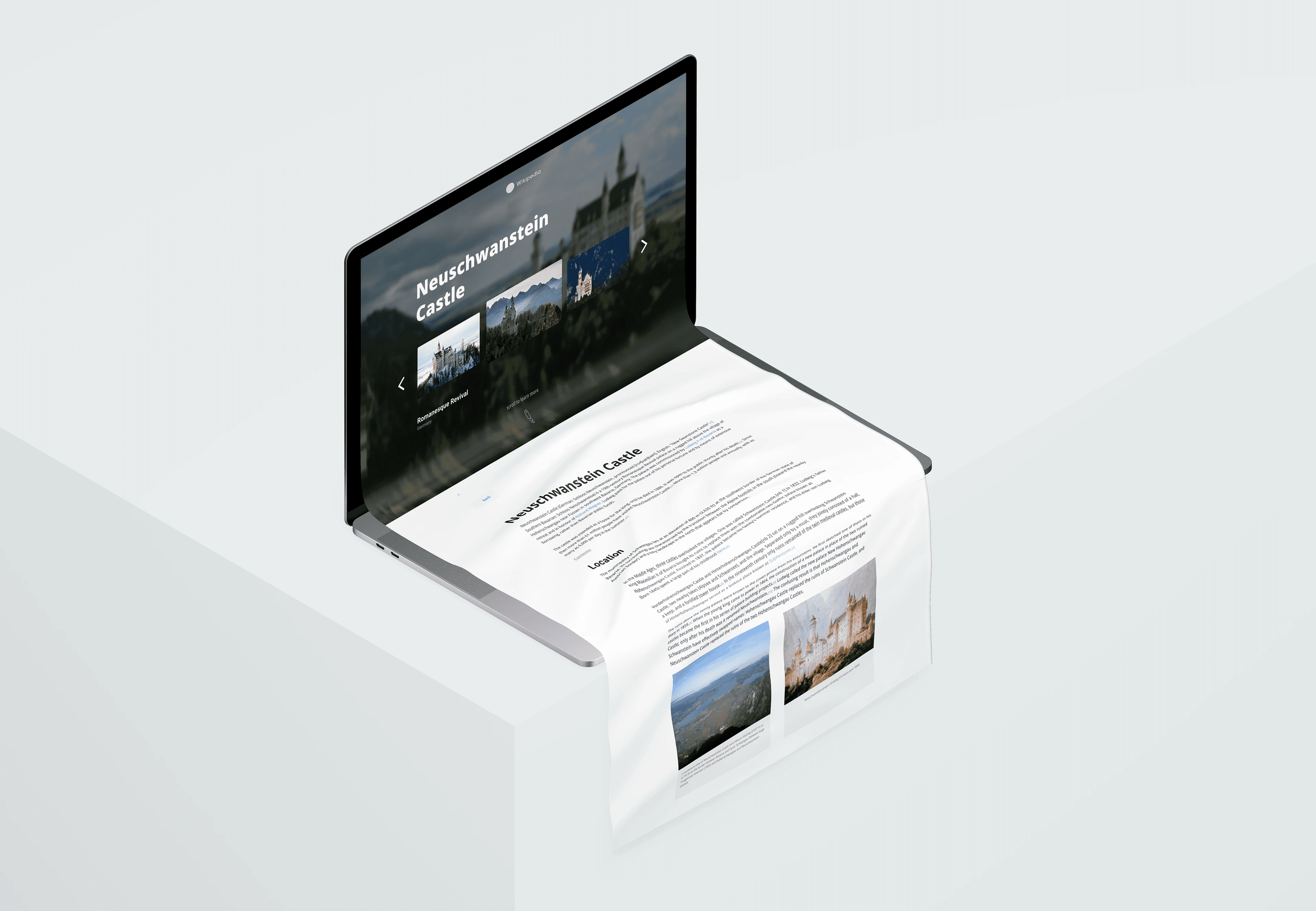
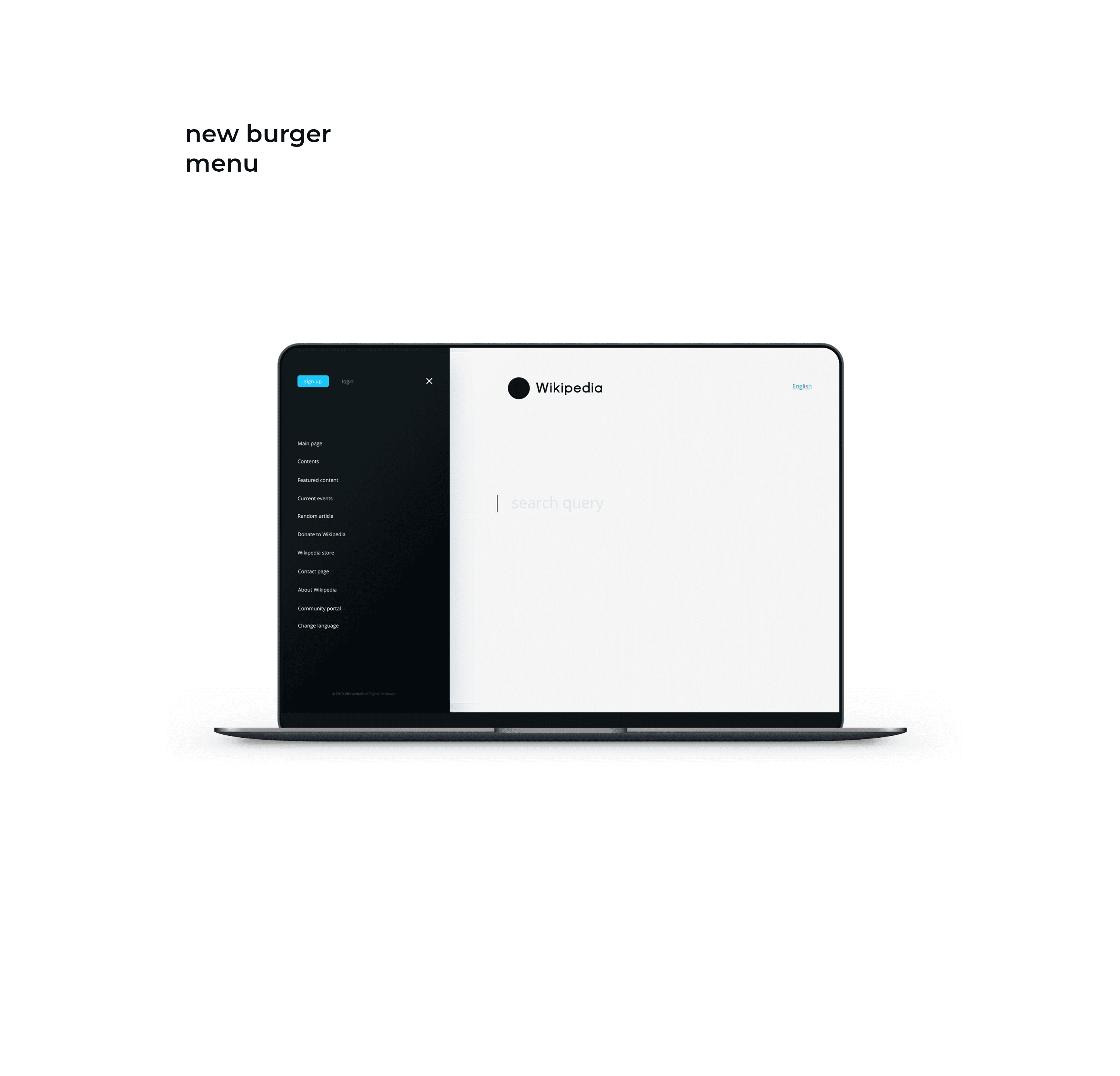
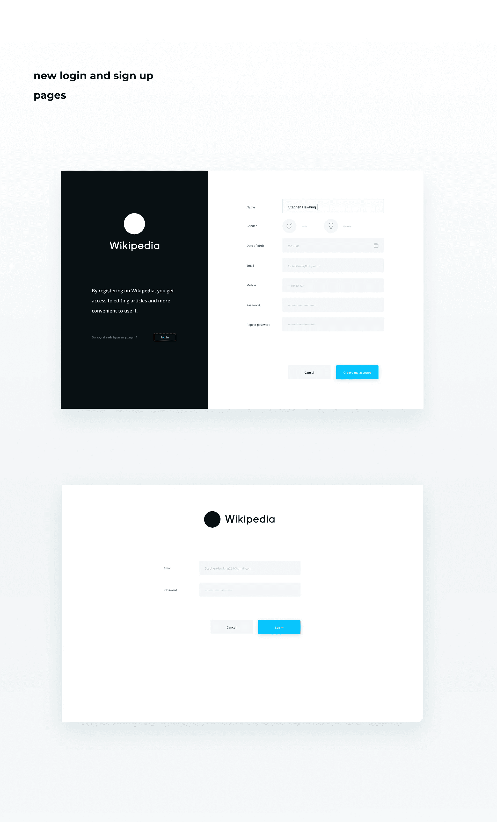
I ran a complete UX process from start to finish: structural analysis of the existing site, user research to understand who visits Wikipedia and why, site mapping to rethink the information architecture, sketching, wireframing, and finally UI design. The biggest structural decision was removing all secondary navigation from the main page and consolidating it into a clean burger menu, leaving the homepage as a pure, distraction-free search experience. The article page was redesigned with a full-width hero image system and a clean reading layout that finally lets the content do its job. A dark/light mode approach was applied throughout, and the entire design was built adaptive from desktop down to mobile, addressing the reality that the majority of Wikipedia's traffic comes from phones. The typography system used Open Sans across a clear hierarchy to ensure readability at every scale.
Projects
Explore more like this one


Selected projects that reflect my approach to design, development, and execution.